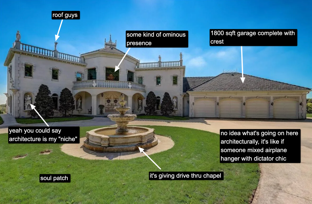
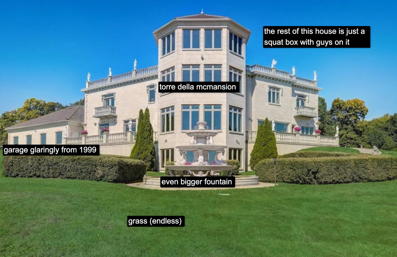
I don’t know why, but every city, no matter how big, has some insanely stacked dictator-looking McMansion somewhere outside the city limits. If you sort your Zillow results as Price: High - Low, this house will pop up first. It costs something like $5,000,000. It is 10,000 square feet. There are usually frescos and tawdry gildedness of some variety. The realtor’s text brags of marble and uses the word “Manor.”
Today, our house, squarely in this category, is found in the suburbs of Milwaukee, WI, not really a place known for unhinged 21st century robber barons. In fact, I find Wisconsin to be one of the least McMansion-dense states in the country. Even the guy who invented Culvers or the Milwaukee Bucks probably has a much less insane house than the one I’m about to show you:
Built in 1999 (owing to what kind of economic event outside of perhaps the dot-com bubble, I’m not sure), this house is indeed around $5 million and 10,000 square feet. I am not sure how much of the square footage includes the garage. Anyway, if you told me this house was from Wisconsin, I would not have believed you. Illinois, maybe, the DC area, maybe, California, maybe, Texas, most likely. But no. It is in Milwaukee and it is the one house in the surrounding area that looks like this and costs this much.
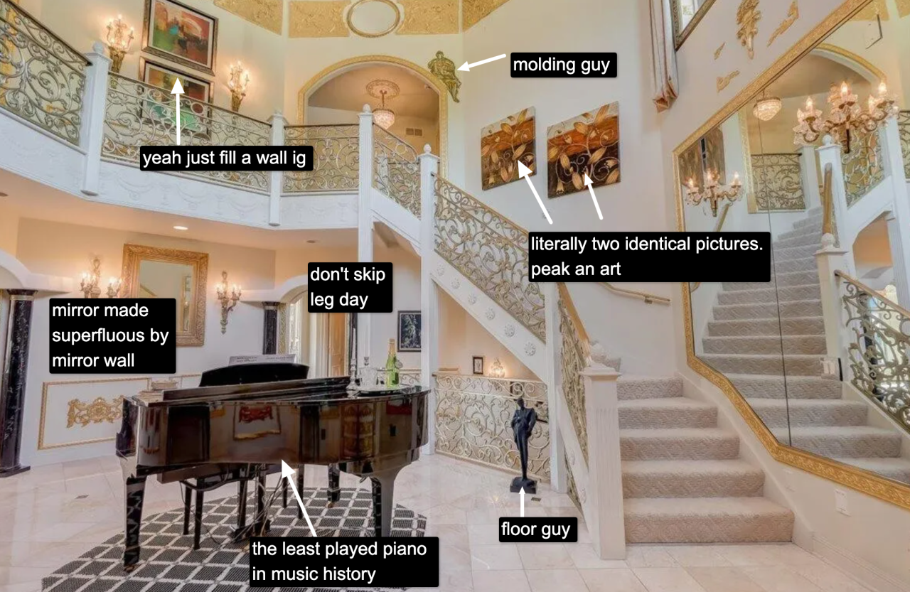
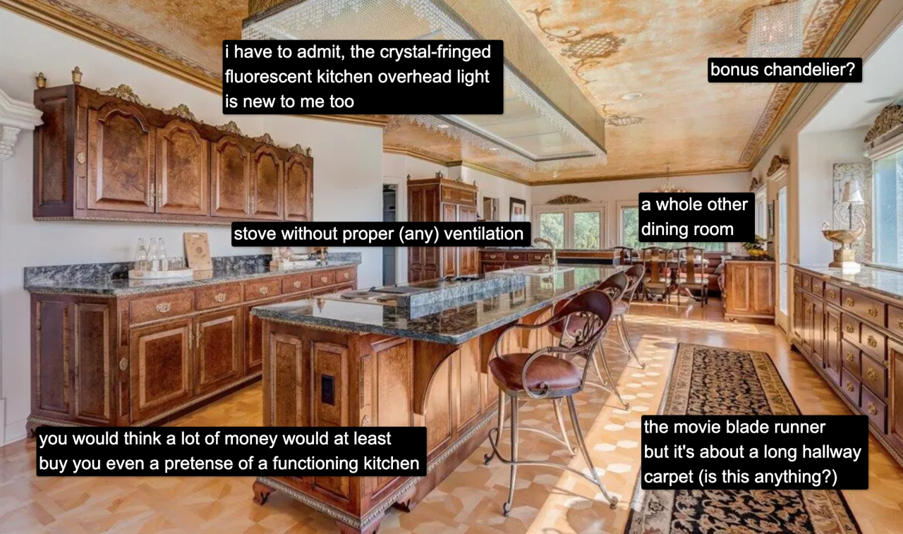
In typical local-magnate fashion, the house opens up with white and gilding. This is how you know the people who live there are really rich and have Made It. All the McMansion signifiers are present: chopsticks machine, lawyer foyer, puzzling and dull art, always in imitation of something architecturally undefined but possibly French.
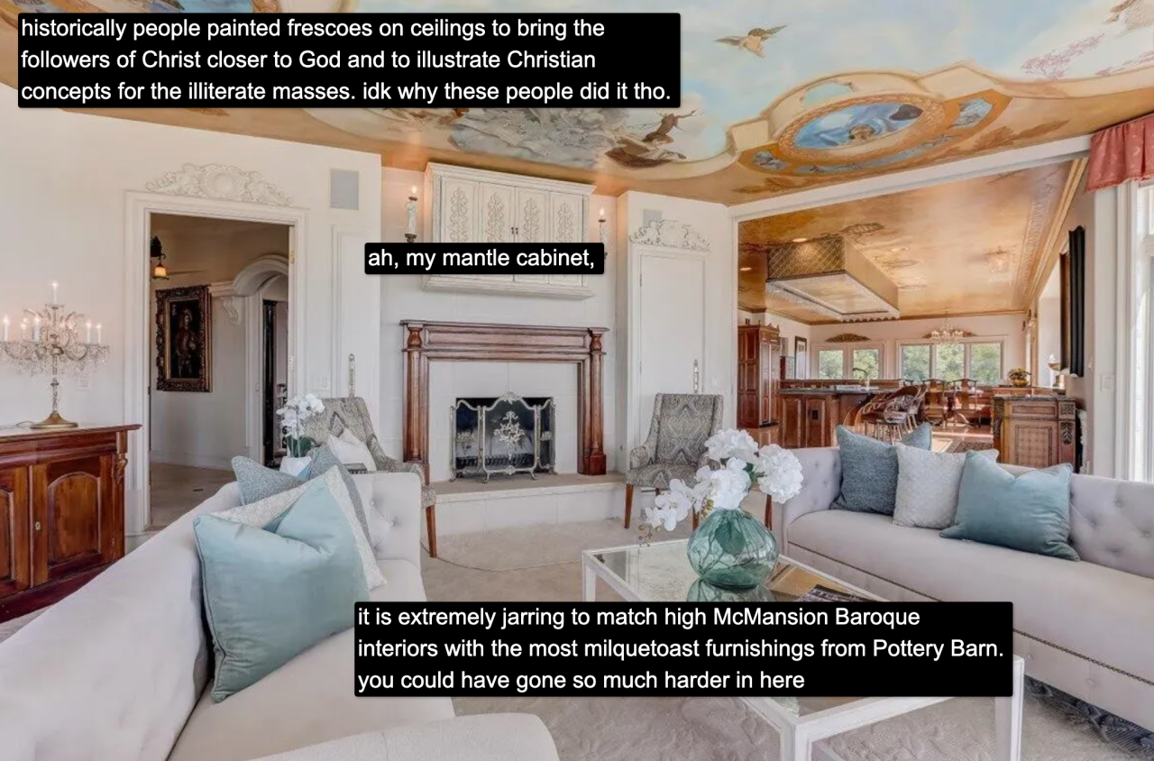
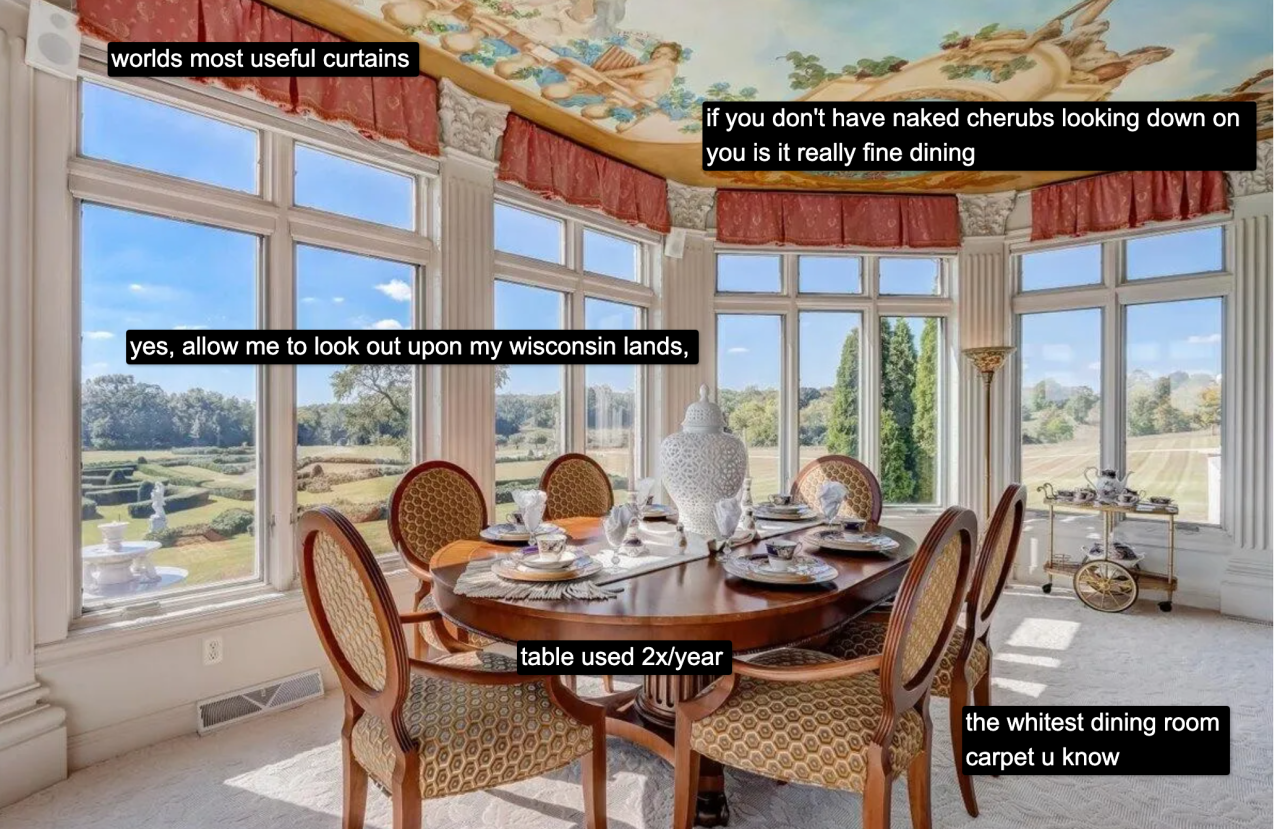
In an attempt to not be too off-putting (indeed, having a ceiling full of religious symbolism seems a bit overzealous even if its purpose is to scream “I HAVE MEDICI-LEVEL AMOUNTS OF MONEY”), the house is furnished, well, normally. It cannot decide whether it wants to sell (it will never sell) or if it wants to lean into being an eccentric millionaire’s house. This is very cowardly.
Perhaps the decorative thought process comes from a desire to elevate the ordinary into the realm of the sublime. Sure, let’s go with that and not the fact that obscenely rich people are uniquely obsessed with French Rococo aesthetics because they long for a time when democracy wasn’t real.
On the other hand, I guess you don’t really need a functional kitchen if you never have to work a day in your life!
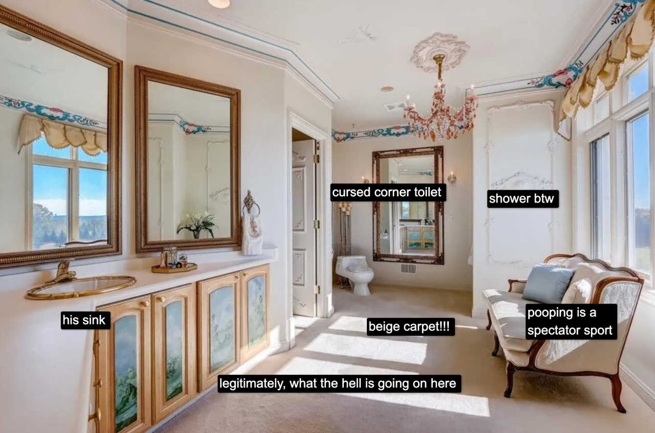
One thing that strikes me about extremely rich people is sometimes they don’t know how ordinary people live and function and in this case, design a bathroom. Hence, they are one clogged toilet away from carpet replacement. Imagine living life on the edge like that.
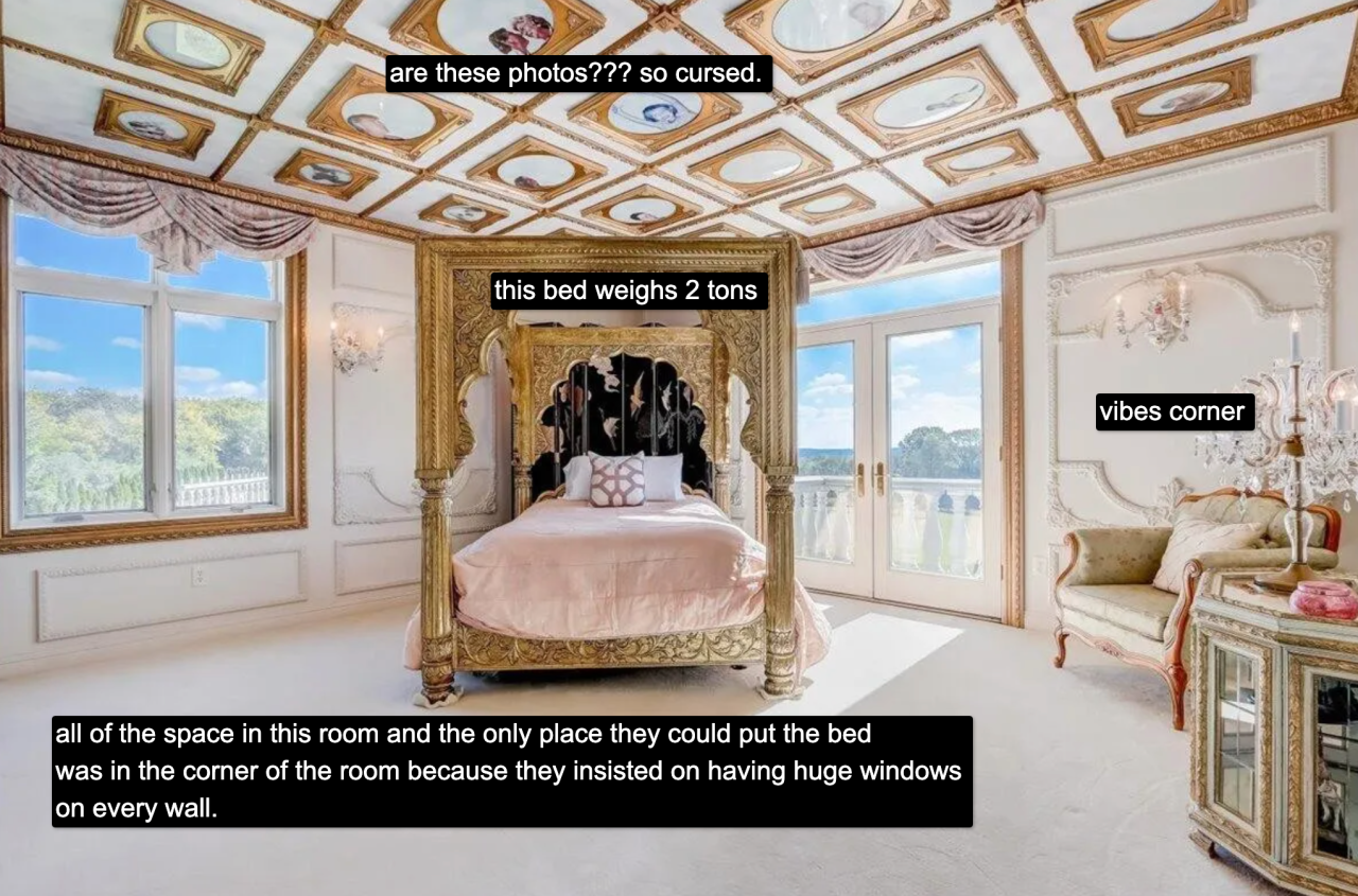
“I wish to lie awake and stare wistfully into copies of my visage.” - things totally normal people would say.
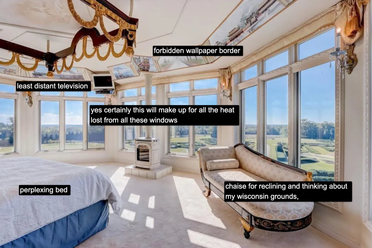
Everyone needs to have one chinoiserie room in their house - it’s part of being a global citizen. Also I appreciate the effort of turning six acres in Wisconsin into Versailles 2. That’s a worthy endeavor because $6 million dollars goes half as far in California. You might be able to buy a shrub for that much.
Finally, we reach the rear of the house, which is, well, phallic:
Obviously this is paying homage to the vernacular forms of the grain silo. Or something.
Happy New Year.
on grayness in real estate
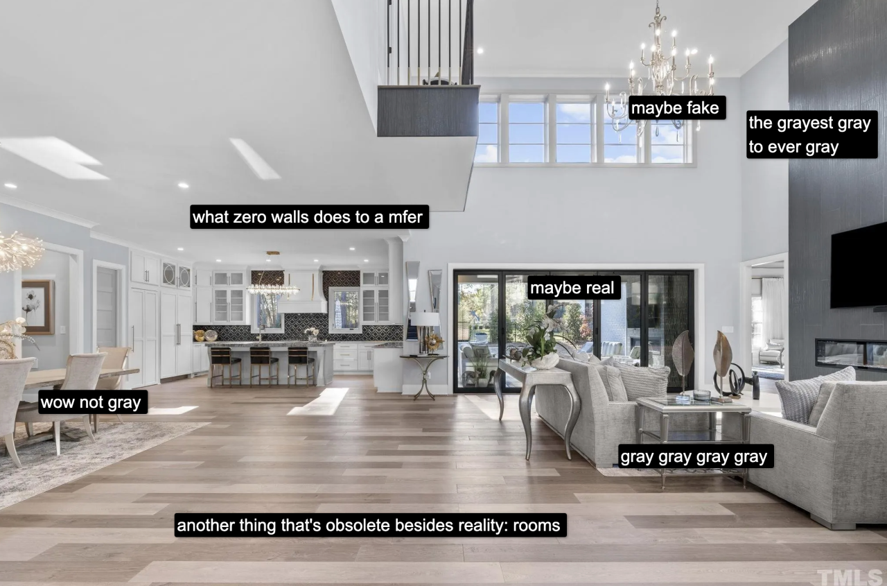
Allegedly, somewhere in Wake Forest, North Carolina, a 4 bed, 5.5 bathroom house totaling more than 6,600 square feet is for sale at a price of 2.37 million dollars. The house, allegedly, was built in 2021. Allegedly, it looks like this:
A McMansion is, in effect, the same house over and over again - it’s merely dressed up in different costumes. In the 90s, the costume was Colonial; in the 2000s, it was vague forms of European (Tuscan, Mediterranean), and in the 2010s it was Tudor, dovetailed by “the farmhouse” – a kind of Yeti Cooler simulacra of rural America peddled to the populace by Toll Brothers and HGTV.
Now, we’re fully in the era of whatever this is. Whitewashed, quasi-modern, vaguely farmhouse-esque, definitely McMansion. We have reached, in a way, peak color and formal neutrality to the point where even the concept of style has no teeth. At a certain moment in its life cycle, styles in vernacular architecture reach their apex, after which they seem excessively oversaturated and ubiquitous. Soon, it’s time to move on. After all, no one builds houses that look like this anymore:
(This is almost a shame because at least this house is mildly interesting.)
If we return to the basic form of both houses, they are essentially the same: a central foyer, a disguised oversized garage, and an overly complex assemblage of masses, windows, and rooflines. No one can rightfully claim that we no longer live in the age of the McMansion. The McMansion has instead simply become more charmless and dull.
When HGTV and the Gaineses premiered Fixer Upper in 2013, it seemed almost harmless. Attractive couple flips houses. Classic show form. However, Fixer Upper has since (in)famously ballooned into its own media network, a product line I’m confronted with every time I go to Target, and a general 2010s cultural hallmark not unlike the 1976 American Bicentennial - both events after which every house and its furnishings were somehow created in its image. (The patriotism, aesthetic and cultural conservatism of both are not lost on me.)
But there’s one catch: Fixer Upper is over, and after the Gaineses, HGTV hasn’t quite figured out where to go stylistically. With all those advertisers, partners, and eyeballs, the pressure to keep one foot stuck in the rural tweeness that sold extremely well was great. At the same time, the network (and the rest of the vernacular design media) couldn’t risk wearing out its welcome. The answer came in a mix of rehashed, overly neutral modernism – with a few pops of color, yet this part often seems omitted from its imitators – with the prevailing “farmhouse modern” of Magnolia™ stock. The unfortunate result: mega-ultra-greige.
Aside from war-mongering, rarely does the media manufacture consent like it does in terms of interior design. People often ask me: Why is everything so gray? How did we get here? The answer is because it is profitable. Why is it profitable? I’d like to hypothesize several reasons. The first is as I mentioned: today’s total neutrality is an organic outgrowth of a previous but slightly different style, “farmhouse modern,” that mixed the starkness of the vernacular farmhouse with the soft-pastel Pinterest-era rural signifiers that have for the last ten years become ubiquitous.
Second, neutrals have always been common and popular. It’s the default choice if you don’t have a vision for what you want to do in a space. In the 2000s, the neutrals du jour were “earth tones” - beige, sage green, brown. Before that, it was white walls with oak trim in the 80s and 90s. In the 70s, neutrals were textural: brick and wood paneling. We have remarkably short memories when it comes to stylistic evolution because in real time it feels incremental. Such is the case with neutrals.
Finally, the all-gray palette is the end logic of HGTV et al’s gamified methodology of designing houses with commodification in mind: if you blow out this wall, use this color, this flooring, this cabinetry, the asking price of your house goes up. You never want to personalize too much because it’s off-putting to potential buyers. After twenty years of such rhetoric, doesn’t it make all the sense in the world that we’ve ended up with houses that are empty, soulless, and gray?
A common realtor adage is to stage the house so that potential buyers can picture their own lives in it. In other words, create a tabula rasa one can project a fantasy of consumption onto. Implied in that logic is that the buyer will then impose their will on the house. But when the staged-realtor-vision and general-mass-market aesthetic of the time merge into a single dull slurry, we get a form of ultra-neutral that seems unwelcoming if not inescapable.
To impose one’s style on the perfect starkness is almost intimidating, as though one is fouling up something untouchable and superior. If neutrality makes a house sell, then personality - at all - can only be seen as a detriment. Where does such an anti-social practice lead us? Back to the house that may or may not exist.
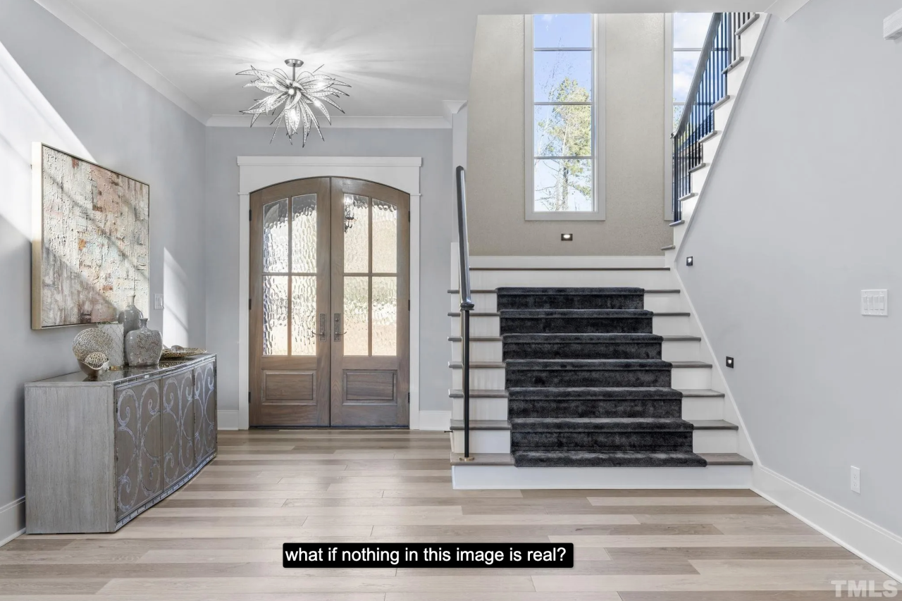
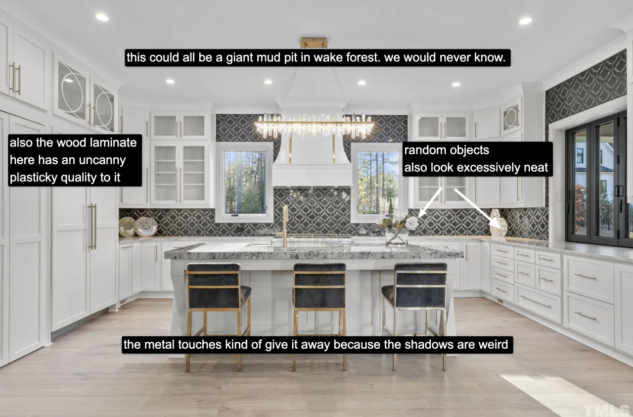
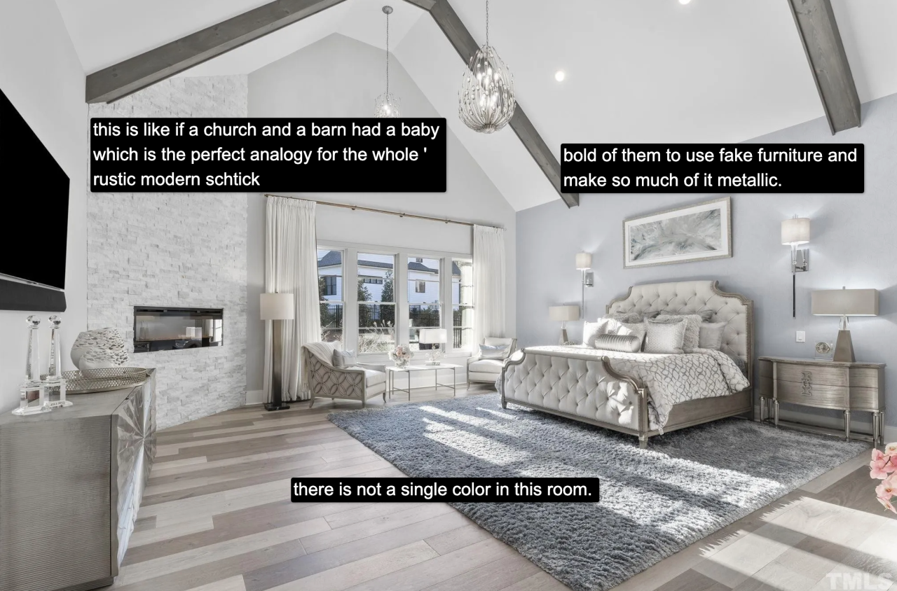
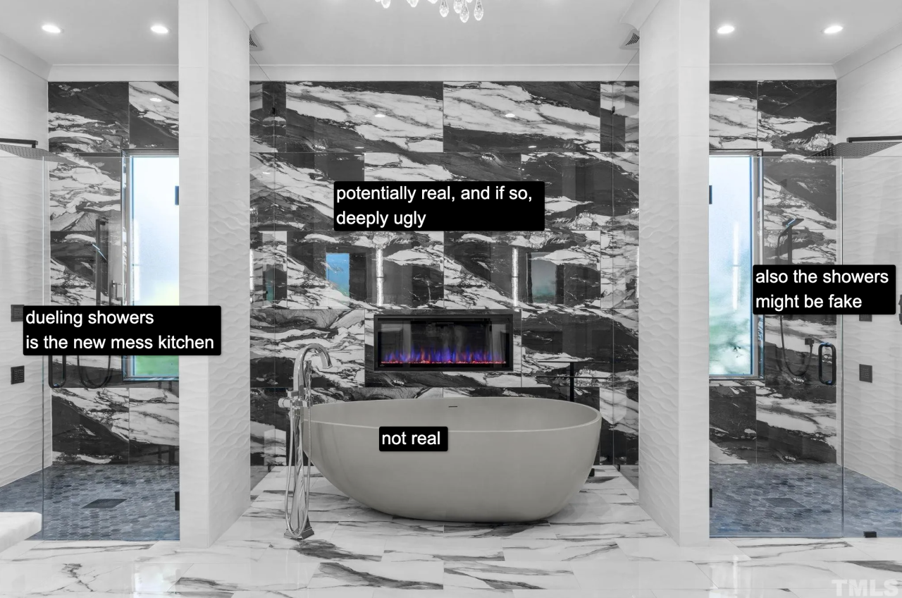
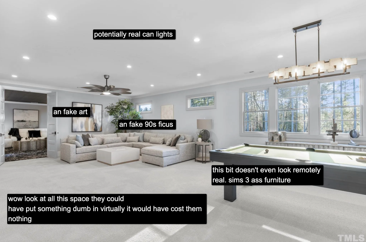
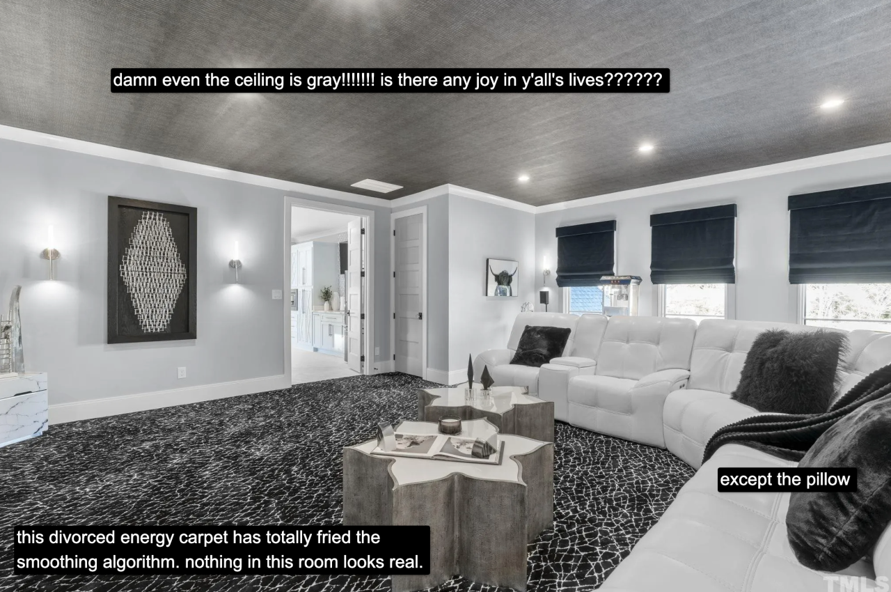
In my travels as McMansion Hell, I’ve increasingly been confronted with houses full of furniture that isn’t real. This is known as virtual staging and it is to house staging as ChatGPT is to press release writing or DALL-E is to illustration. As this technology improves, fake sofa tables are becoming more and more difficult to discern from the real thing. I’m still not entirely sure which of the things in these photos are genuine or rendered. To walk through this house is to question reality.
Staging ultimately pretends (sometimes successfully, sometimes not) that someone is living in this house, that you, too could live in it. Once discovered, virtual staging erases all pretensions: the house is inhabited by no one. It is generally acknowledged (though I’m not sure on the actual statistics) that a house with furniture - that is, with the pretense of living – sells easier than a house with nothing in it, especially if that house (like this one) has almost no internal walls. Hence the goal is to make the virtual staging undiscoverable.
If you want to talk about the realtor’s tabula rasa, this is its final form. Houses without people, without human involvement whatsoever.
But what makes this particular house so uncanny is that all of these things I’ve mentioned before: real estate listing photography, completely dull interiors and bland colors all make it easy for the virtual furniture to work so well. This is because the softness of overlit white and gray walls enables the fuzzy edges of the renderings to look natural when mixed with an overstylized reality. Even if you notice something’s off in the reflections, that’s enough to cause one to wonder if anything in the house is real: the floors, the fixtures, the moulding, the windows and doors.
This is where things are heading: artifice on top of artifice on top of artifice. It’s cheap, it’s easy. But something about it feels like a violation. When one endeavors to buy a house, one assumes what one is viewing is real. It’s one thing if a realtor photoshops a goofy sunset, it’s another to wonder if anything in a room can be touched with human hands. I won’t know what, if any, part of this estate costing over 2 million dollars actually exists until I visit it myself. Perhaps that’s the whole point - to entice potential buyers out to see for themselves. When they enter, they’ll find the truth: a vast, empty space with nothing in it.
The better this rendering technology gets, the more it will rely on these totally neutral spaces because everything matches and nothing is difficult. You are picking from a catalog of greige furniture to decorate greige rooms. If you look at virtual staging in a non-neutral house it looks immediately plastic and out of place, which is why many realtors opt to either still stage using furniture or leave the place empty.
Due to the aforementioned photography reasons, I would even argue that the greigepocalypse or whatever you want to call it and virtual staging have evolved simultaneously and mutualistically. The more virtual staging becomes an industry standard, the more conditions for making it seamless and successful will become standardized as well.
After all, real staging is expensive and depends on paid labor - selecting furniture, getting workers to deliver and stage it, only to pack it back up again once the property is sold. This is a classic example of technology being used to erase entire industries. Is this a bad thing? For freelance and contract workers, yeah. For realtors? no. For real estate listings, it remains to be seen. For this blog? Absolutely. (Thankfully there is an endless supply of previously existing McMansions.)
The thing is, real estate listings no longer reflect reality. (Did they ever to begin with?) The reason we’re all exasperated with greige is because none of us actually live that way and don’t want to. I’ve never been to anyone’s house that looks like the house that may or may not exist. Even my parents who have followed the trends after becoming empty nesters have plenty of color in their house. Humans like color. Most of us have lots of warmth and creativity in our houses. Compare media intended for renters and younger consumers such as Apartment Therapy with HGTV and you will find a stark difference in palate and tone.
But when it comes to actually existing houses - look at Zillow and it’s greige greige greige. So who’s doing this? The answer is real estate itself aided by their allies in mass media who in turn are aided by the home renovation industry. In other words, it’s the people who sell home as a commodity. That desire to sell has for some time overpowered all other elements that make up a home or an apartment’s interiority to the point where we’ve ended up in a colorless slurry of real and unreal.
Fortunately, after ten years or so, things begin to become dated. We’re hitting the ten year mark of farmhouse modernism and its derivatives now. If you’re getting sick of it, it’s normal. The whole style is hopefully on its last leg. But unlike styles of the past, there’s a real, trenchant material reason why this one is sticking around longer than usual.
Hence, maybe if we want the end of greige, we’re going to have to take color back by force.
Howdy folks! In honor of Halloween, here are some of the scariest houses currently for sale in the ever-cursed suburbs of Washington, DC. It’s been awhile since I checked in on this particular hotspot, and once more, it did not disappoint.
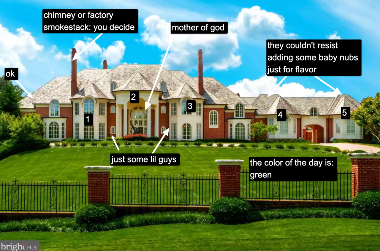
I’ll just get this one out of the way. Long-time McMansion Hell-heads are well aware of this monster estate in Potomac, MD, once allegedly owned by a particular professional athlete who will not be named, because the house should suck on its own merit. The only nice thing I can say about this house is that the designers kept the materials and colors consistent, which adds some unity to what is, in reality, five turrets in a trench coat.
Some things, the economists tell us, are too big to fail. This is not one of them. Let’s move on.
Many McMansions exist to mock the concept of architectural consistency and historical continuity. This is one of them. About every single type of expanded second-story window elaboration exists here: bay window, covered balcony, juliet balcony. None of them work. The house can’t decide if its 19th century eclecticism or tony DC Georgian/Federal cocktail. The random cupola merely adds insult to injury.
I don’t know where realtors learned how to do photoshop, but whoever taught them should have their Adobe licenses revoked. There’s a certain type of McMansion I call a “hat house” - which is exactly what it sounds like. It’s a house with multiple bays or masses and each has its own special hat. This is one of the most egregious examples because all of the hats are different shapes and scales. Not even the most Disney Theme Park pink sky and fairy lighting can mitigate the controlling aesthetic influence of hät.
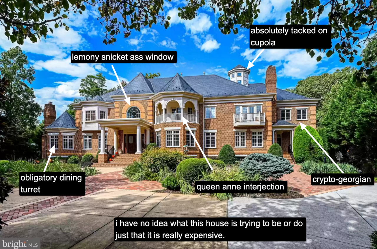
No compilation of Bad Facades would be complete without at least one Frankentudor™. Rich people in America really like to harken back to the days of feudalism, yet uglier, more drab, and using materials mostly derived from petrochemicals. The lighting is not helping this house, which is about as gloomy, hulking, and bloated as they come.
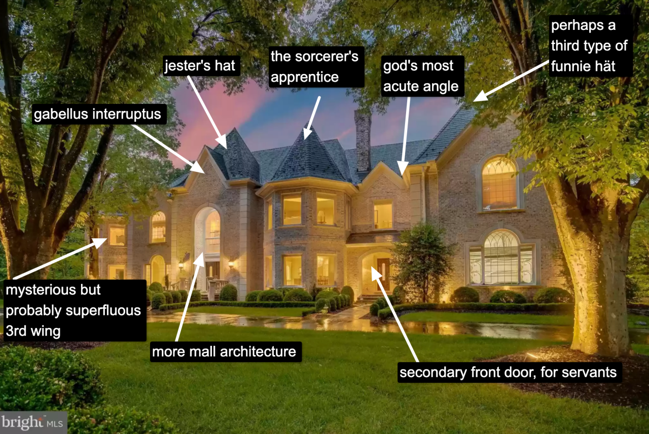
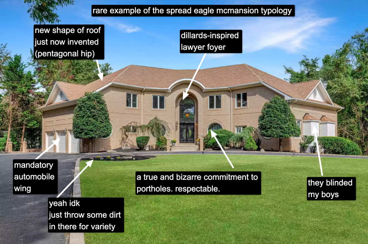
I have some fondness for houses that derive new, inventive forms of being ugly. The spread eagle McMansion is one of them, two oblique wings with no real core. A corner lot specimen. This one is especially weird, with the quadruple portholes, the windowless bays, the mall foyer, and the hipped roof that’s not quite clipped, complete with tacked on gables. Kind of neat, sad to say.
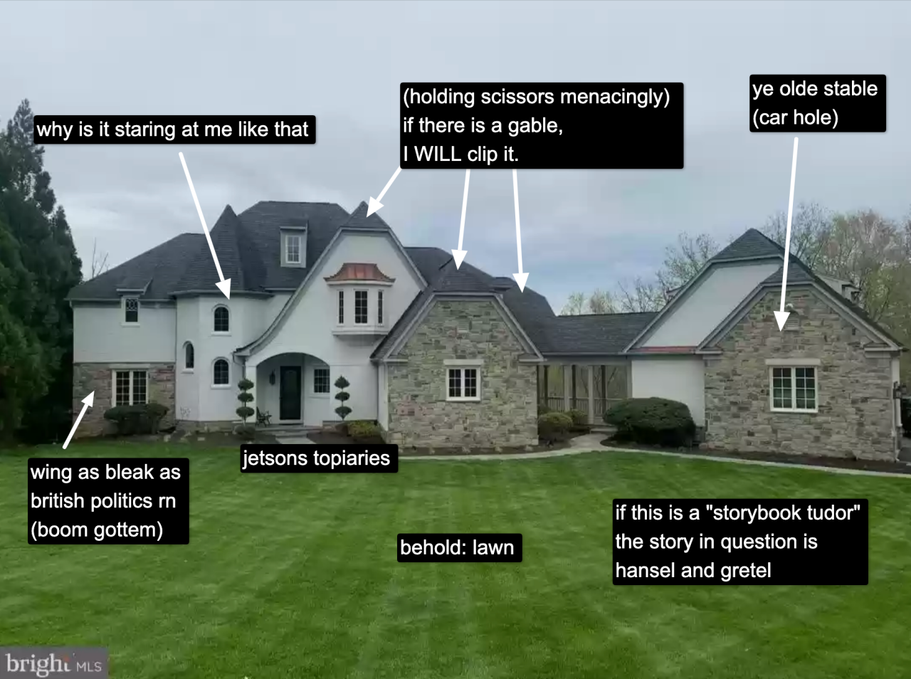
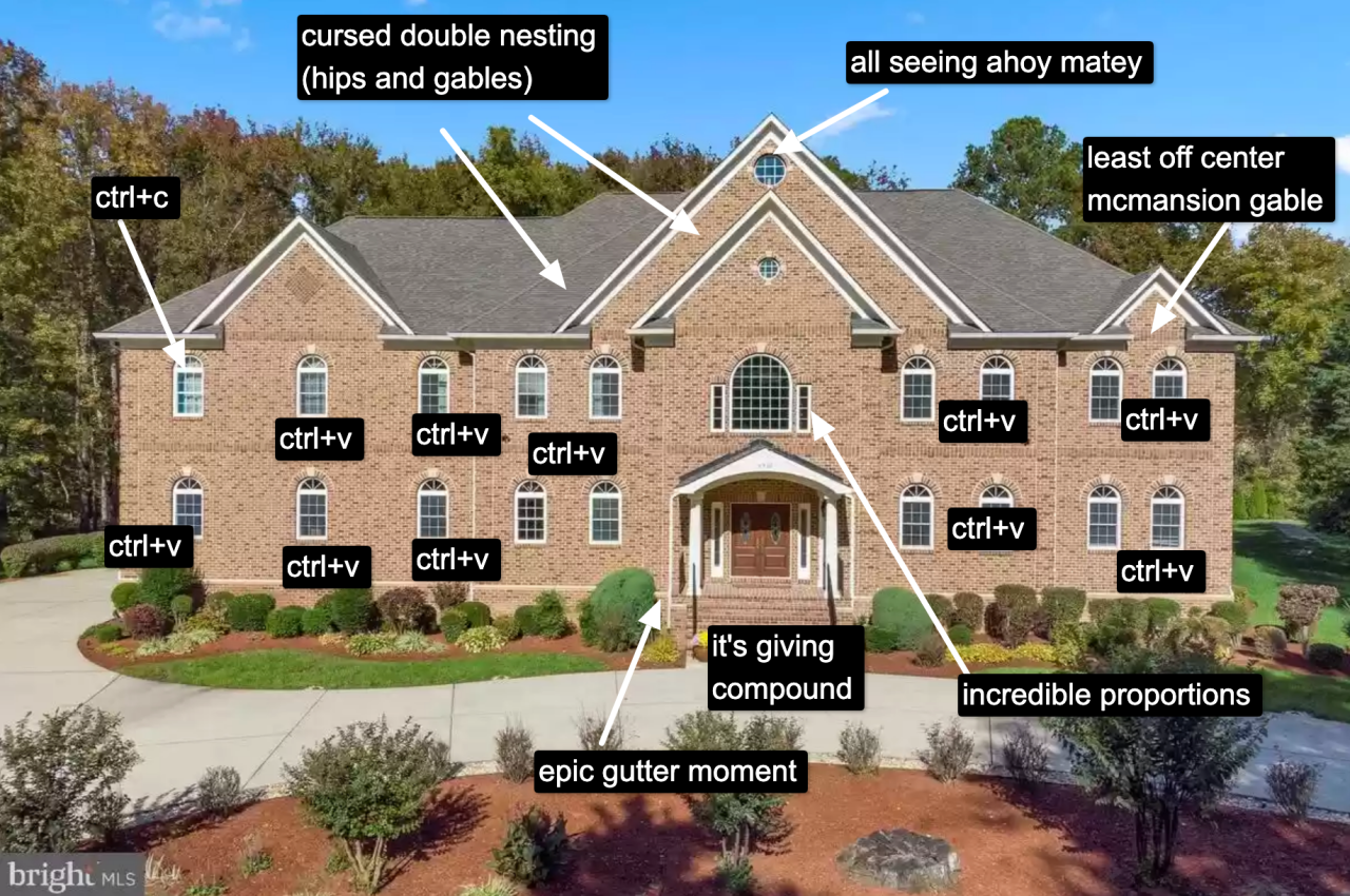
I know most of you won’t agree, but I actually believe this is the worst McMansion of the set. The absolute banality of it, the out-of-proportion everything, the compound-like demeanor, the nonsensical spacing of the mind-numbingly identical windows. The most infuriating part is that whoever designed this had some kind of order, continuity, proportion in mind and just failed utterly at it, like Sideshow Bob stepping on all those rakes. I hate it!!!!
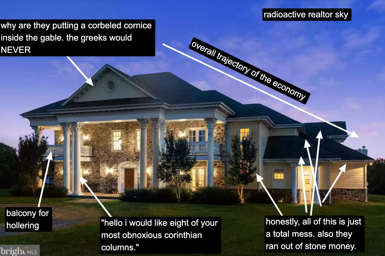
When rich people try to make overly-inflated temples to their dumb piles of money, it’s deeply satisfying when they end up looking like this house, which is just a pile of roof and wall tacked on to the worst proportioned portico imaginable. Classic McMansion Hubris. Let us all laugh.
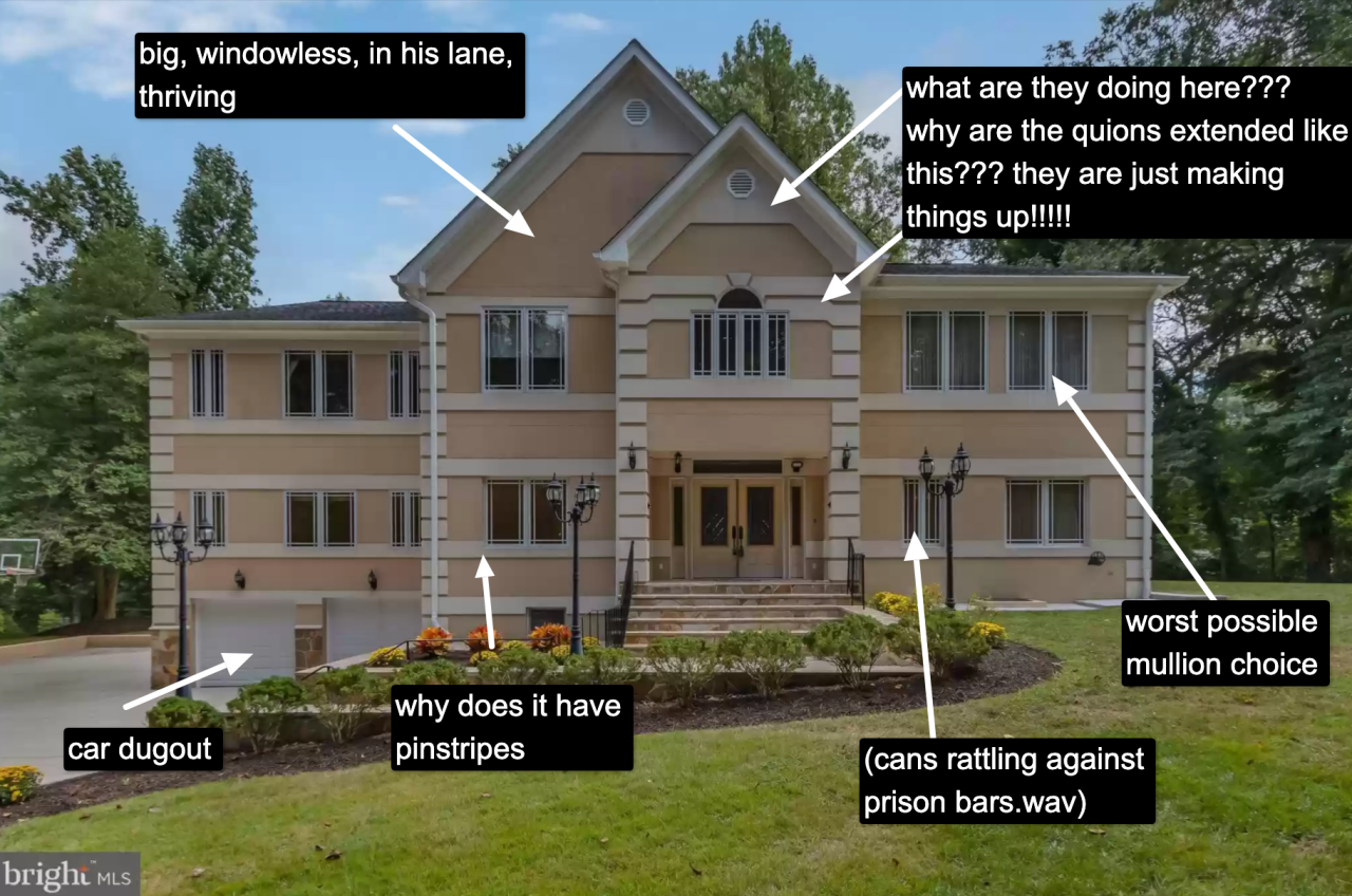
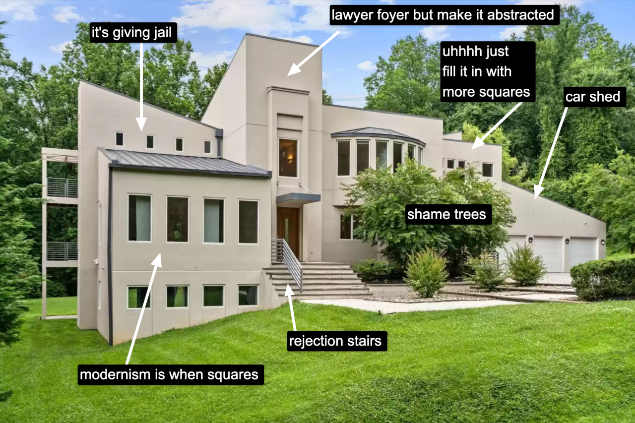
Now we’re getting into the more eldritch horror part of the list. Some houses make me wonder if I have the same set of eyeballs and conceptions of what “a house” looks like as other people. This one is playing dress up games with foam stickers. It looks like Steve’s shirt from Blues Clues. It abuses the prairie muntins, which is an insult to my chosen hometown of Chicago, Illinois. Bad house.
Not enough time is devoted on this blog to bad modernism, though it would be rather generous to call this house modern. It’s more like postmodernism trying to remember what modernism looked like and tripping down a flight of stairs collecting random masses and windows on the way down. Houses like this give modern architecture a bad name. It’s borderline libel. Also it looks like it was made out of cardboard.
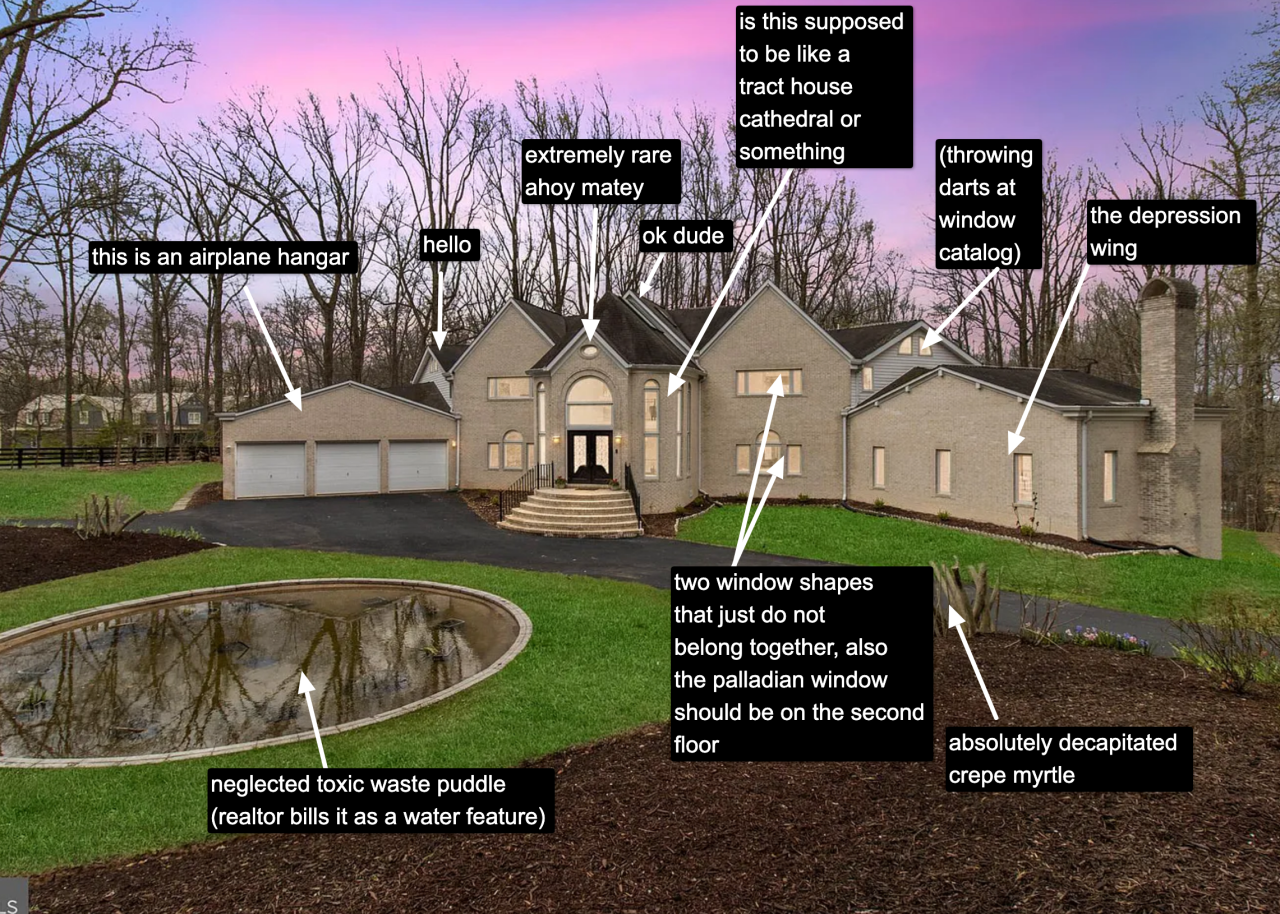
This brings us to our final, and objectively worst house:
I don’t even know what to say about this freak of architecture. I don’t know how it came together or why. I don’t know what it wants or even pretends to do. It is a horrorshow. Gables protruding from random places, stealth roof fragments, windows too small for the walls they’re embedded in, a weird cathedral-like entrance, the mosquito-infested pond, the worst example of realtor sky I’ve ever seen, all of it is terrible. It’s haunted. Trick or Treat, but without the treat.
Anyway, that does it for this installment. If you’re curious about more McModern badness, this month’s Patreon bonus post will be to your liking!
Happy Halloween and Día de Los Muertos!